

THE CHALLENGE
Northeast Ohio’s largest full-service produce distributor wanted to modernize its overall brand and reflect its current state of the organization, while also maintaining elements of the brand’s proud history.
THE STRATEGY & SOLUTION
Dix & Eaton approached the logo design process as an evolution to ensure we did not lose the company’s established corporate identity and history.
The two major focus areas for the updated logo included:
- Expanding the color palette: making sure to complement the existing corporate palette, while also bringing vibrancy and energy to the logo
- Shapes reflective of produce: using abstract geometric elements to bring a fresh, modern feel to the mark that references the nature of Sanson’s business
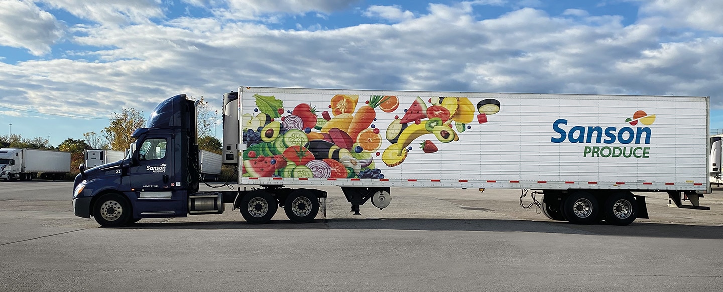
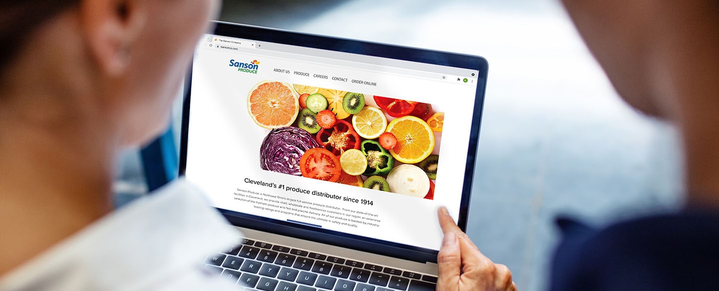
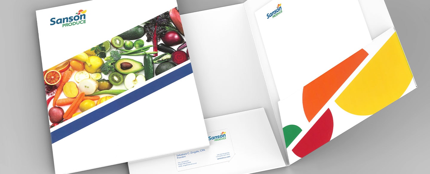
RESULTS
We built an entire brand identity system including new advertising, business cards and website integration. The new brand can be seen on delivery trucks throughout Northeast Ohio and has provided Sanson with an energetic, identifiable new face to the customer.